Saturday, December 26, 2015

How to Add a Shortcodes User Interface in WordPress with Shortcake

If you are developing a WordPress site for a client, then it’s likely that you will have shortcodes for your clients to use. The problem is that many beginners don’t know how to add shortcodes and if there are complex parameters involved, then it’s even more difficult. Shortcake provides a solution by adding a user interface for shortcodes. In this article, we will show you how to add a user interface for shortcodes in WordPress with Shortcake.

What is Shortcake?

WordPress offers an easier way to add executeable code inside posts and pages by using shortcodes. Many WordPress themes and plugins allow users to add additional functionality using shortcodes. However, sometimes these shortcodes can become complicated when a user needs to enter parameters for customization.

For example, in a typical WordPress theme if there is a shortcode to enter a button, then the user will probably need to add atleast two to five parameters. Like this:

[themebutton url=”http://example.com” title=”Download Now” color=”purple” target=”newwindow”]

Shortcake is a WordPress plugin and a proposed future WordPress feature. It aims to solve this problem by providing a user interface to enter these values. This will make shortcodes a lot easier to use.

Shortcake Bakery Plugin

Getting Started

This tutorial is aimed for users who are new to WordPress development. Beginner level users who like to tweak their WordPress themes would also find this tutorial helpful.

Having said that, let’s get started.

First thing you need to do is install and activate the Shortcake (Shortcode UI) plugin.

You will now need a shortcode that accepts a few parameters of user input. If you need a little refresher, here is how to add a shortcode in WordPress.

For the sake of this tutorial we will be using a simple shortcode that allows users to insert a button into their WordPress posts or pages. Here is the sample code for our shortcode, and you can use this by adding it to your theme’s functions file or in a site-specific plugin.

add_shortcode( 'cta-button', 'cta_button_shortcode' );

function cta_button_shortcode( $atts ) {
       extract( shortcode_atts(
               array(
                       'title' => 'Title',
                       'url' => ''
               ),
               $atts
       ));
       return '' . $title . '';
}

You will also need to add some CSS to style your button. You can use this CSS in your theme’s stylesheet.


.cta-button {
padding: 10px;
font-size: 18px;
border: 1px solid #FFF;
border-radius: 7px;
color: #FFF;
background-color: #50A7EC;
}

This is how a user will use the shortcode in their posts and pages:

[cta-button title="Download Now" url="http://example.com"]

Now that we have a shortcode that accepts parameters, let’s create a UI for it.

Registering Your Shortcode User Interface with Shortcake

Shortcake API allows you to register your shortcode’s user interface. You will need to describe what attributes your shortcode accepts, input field types, and which post types will show the shortcode UI.

Here is a sample code snippet we will use to register our shortcode’s UI. We have tried to explain each step with inline comments. You can paste this in your theme’s functions file or in a site-specific plugin.

shortcode_ui_register_for_shortcode(

/** Your shortcode handle */
'cta-button',

/** Your Shortcode label and icon */
array(

/** Label for your shortcode user interface. This part is required. */
'label' => 'Add Button',

/** Icon or an image attachment for shortcode. Optional. src or dashicons-$icon.  */
'listItemImage' => 'dashicons-lightbulb',

/** Shortcode Attributes */
'attrs'          => array(

/**
* Each attribute that accepts user input will have its own array defined like this
* Our shortcode accepts two parameters or attributes, title and URL
* Lets first define the UI for title field. 
*/

array(

/** This label will appear in user interface */
'label'        => 'Title',

/** This is the actual attr used in the code used for shortcode */
'attr'         => 'title',

/** Define input type. Supported types are text, checkbox, textarea, radio, select, email, url, number, and date. */
'type'         => 'text',

/** Add a helpful description for users
'description'  => 'Please enter the button text',
),

/** Now we will define UI for the URL field */

array(
'label'        => 'URL',
'attr'         => 'url',
'type'         => 'text',
'description'  => 'Full URL',
),
),
),

/** You can select which post types will show shortcode UI */
'post_type'     => array( 'post', 'page' ), 
)
);

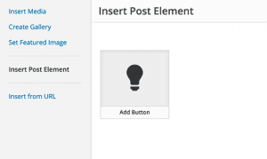
That’s all, you can now see the shortcode user interface in action by editing a post. Simply click on the Add Media button above a post editor. This will bring up the media uploader where you will notice a new item ‘Insert Post Element’ in the left hand column. Clicking on it will show you a button to insert your code.

Inserting your shortcode in a post or page

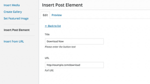
Clicking on the thumbnail containing the lightbulb icon and your shortcake label will show you the shortcode UI.

User interface for a simple shortcode

Adding Shortcode With Multiple Inputs

In the first example, we used a very basic shortcode. Now lets make it a little more complicated and a lot more useful. Let’s add a shortcode that allows users to choose a button color.

First we will add the shortcode. It is nearly the same shortcode, except that it now excepts user input for color.


add_shortcode( 'mybutton', 'my_button_shortcode' );

function my_button_shortcode( $atts ) {
       extract( shortcode_atts(
               array(
                       'color' => 'blue',
                       'title' => 'Title',
                       'url' => ''
               ),
               $atts
       ));
       return '' . $title . '';
}

Since our shortcode will be showing buttons in different colors so we will need to update our CSS too. You can use this CSS in your theme’s stylesheet.

.mybutton {
    padding: 10px;
    font-size: 18px;
    border: 1px solid #FFF;
    border-radius: 7px;
    color: #FFF;
}

.blue-button  {
    background-color: #50A7EC;
}
.orange-button { 
background-color:#FF7B00;
} 

.green-button { 
background-color:#29B577;
}

This is how the buttons will look like:

Call to action buttons created with shortcode

Now that our shortcode is ready, the next step is to register shortcode UI. We will be using essentially the same code, except that this time we have another parameter for color and we are offering users to select from blue, orange, or green buttons.

shortcode_ui_register_for_shortcode(

/** Your shortcode handle */
'mybutton',

/** Your Shortcode label and icon */
array(

/** Label for your shortcode user interface. This part is required. */
'label' => 'Add a colorful button',

/** Icon or an image attachment for shortcode. Optional. src or dashicons-$icon.  */
'listItemImage' => 'dashicons-flag',

/** Shortcode Attributes */
'attrs'          => array(

/**
* Each attribute that accepts user input will have its own array defined like this
* Our shortcode accepts two parameters or attributes, title and URL
* Lets first define the UI for title field. 
*/

array(

/** This label will appear in user interface */
'label'        => 'Title',

/** This is the actual attr used in the code used for shortcode */
'attr'         => 'title',

/** Define input type. Supported types are text, checkbox, textarea, radio, select, email, url, number, and date. */
'type'         => 'text',

/** Add a helpful description for users */
'description'  => 'Please enter the button text',
),

/** Now we will define UI for the URL field */

array(
'label'        => 'URL',
'attr'         => 'url',
'type'         => 'text',
'description'  => 'Full URL',
),

/** Finally we will define the UI for Color Selection */ 
array(
'label'		=> 'Color',
'attr'      => 'color',

/** We will use select field instead of text */
'type'		=> 'select',
    'options' => array(
        'blue'		=> 'Blue',
        'orange'	=> 'Orange',
        'green'		=> 'Green',
    ),
),

),

/** You can select which post types will show shortcode UI */
'post_type'     => array( 'post', 'page' ), 
)
);

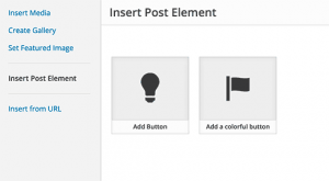
That’s all, you can now edit a post or page and click on the Add Media button. You will notice your newly added shortcode under ‘Insert Post Elements’.

Selecting post element or shortcode to insert

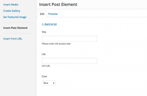
Clicking on your newly created shortcode will bring up the shortcode UI, where you can simply enter the values.

Shortcode UI with a select field

You can download the code used in this tutorial as a plugin.

wpb-shortcake-tutorial

We have included the CSS, so you can use it to study or use it to add your own call to action buttons in WordPress using an easier user interface. Feel free to modify the source and play with it.

We hope this article helped you learn how to add a user interface for shortcodes in WordPress with Shortcake. You may also want to take a look at these 7 essential tips for using shortcodes in WordPress.

If you liked this article, then please subscribe to our YouTube Channel for WordPress video tutorials. You can also find us on Twitter and Facebook.

The post How to Add a Shortcodes User Interface in WordPress with Shortcake appeared first on WPBeginner.

How to Prep Your Website for 2016

As 2015 draws to a close, now is the time to take stock in your site and see what works, what doesn’t, and what can be changed for the better.

Sure, you can put it off until January 1st, but wouldn’t it be a better idea to start the new year with a plan already in place? It’s likely just psychological, but knowing what I intend to do for the next year can make all the difference in terms of how I approach my business when sitting down to work.

All website owners should go over the following list before the ball drops on new year’s eve, but WordPress site owners especially can benefit from the steps laid out here. 

1. Consider a Site Overhaul

It’s almost a new year—could it be time for a new look, too? I know it sounds drastic, but now is the perfect time to evaluate the look of your site and think about whether or not it’s working for you. Checking out your analytics can give you some sense of this, at least in terms of whether or not specific design elements are working like your calls-to-action and graphics.

Now’s the time to investigate those themes you bookmarked throughout the year and thought “maybe…but not now” about. Open them up, read reviews, and check out the demos. Would a new theme serve your site in an important way? Would it greatly enhance its function?

But you don’t necessarily need to think as big as a new theme, either. You can also invest in a new plugin that affects design like a custom widget or a different header image. You might want to change up your logo a bit or redesign your newsletter signup form.

Another good idea is to come up with a branded style for each of your blog posts. You can use this same style of image on every post and across social media. Coming up with a template for this now can save you time in the new year and ensures your business is presented in a seamless and professional way across all channels.

Whatever you choose to do, know that even the smallest change can make a lasting impact on how your site is perceived by visitors and prospects.

Here are a few posts with tons of great theme ideas for giving your site a refresh:

2. Analyze Your Top Performing Posts & Pages (And Copy Them)

This one’s a bit subjective, but it’s important just the same. Before the new year starts, take this opportunity to go over the pages and posts that have performed the best according to your site’s analytics and figure out what makes them so effective. Is there something on these pages that helps drive conversions? Is the copy particularly great? Is there a graphic that’s compelling visitors to click?

Go over these pages in detail and figure out what elements you can apply to your other posts and pages, as well as any new posts you write in the new year. It doesn’t have to be all that complicated, either. Maybe your best performing content all have a bold featured image. Maybe your long reads perform the best. Whatever it is these pages have in common, try to mirror that aspect on future content to make every new post your best post.

In case you’re aren’t sure, here’s a guide for installing Google Analytics:

3. Analyze Your Most Important Content (And Fix It)

Certain pages on your site are always going to receive a certain amount of traffic just for what content they’re expected to present. A few good examples include your About page, Contact page, and any landing pages you may have. These pages are all designed to do something specific, so it’s your job to evaluate them on occasion to make sure they’re accomplishing what you want/need them to do.

Your analysis should start with the simple things like checking all of the links to make sure they’re working, checking that images look good and that the copy reads well. You should also evaluate these pages to see if they could be working harder for you. Could your CTA use a reboot? Try out a new form style or get new copy written. Could your “Buy Now” buttons use a facelift? Consider a new UI kit. You get the idea.

You don’t have to spend a ton of time on this but revisiting your most important pages periodically helps to ensure you’re getting the most out of your content. Here’s a few posts about content analysis and building better content in general, all year long:

4. Implement A/B Testing on Your Best Content

You know those top performing pages we identified a bit ago? Now’s the time to take a look at them again and identify the ways in which you can improve them. While you can just randomly make changes and hope something increases their effectiveness, a much better approach is to use A/B testing.

Setting up A/B tests on your top performing pages ensures you’re squeezing every last drop of goodness out of them. I mean, you’ve identified that these pages are effective. So, why not make them work even better?

We’ve talked a lot about A/B testing here in the past, so there’s no need to rehash the details. Here are a few posts that cover the topic in depth so you can get started with setting up your own tests ASAP:

5. Update Your 404 Page

If you haven’t already, now is definitely the time to work on customizing your site’s 404 page. A fun design can make a big different here, but something cutesy won’t cut it if it doesn’t actually direct wayward visitors back along the path to the appropriate page. Input your site’s URL incorrectly a few times to see what comes up. If you have suggested searches on your 404 page (which you should) ensure these links are relevant to the content you were trying to view.

The 404page plugin is a good choice for customizing what visitors see when they type in the incorrect URL. And you can add a custom search to this page with the Relevanssi plugin.

We’ve talked about 404 pages here in the past, particularly regarding how to remove broken links and the branding opportunity they provide:

6. Develop a Content Plan for Q1 of 2016

Whether you consistently follow an editorial calendar or you just wing it, right now is the time to start getting organized and implementing a sustainable content plan for 2016. You don’t have to plan out the whole year—a month or two at a time will suffice—but having more than just a scattered list of post ideas somewhere will truly help you to build a more effective content strategy overall.

Instead of being stressed out constantly at the prospect of creating new content and all that entails (writing the post, scheduling it, creating graphics, scheduling social media posts, etc) you can go about the process much more methodically. Plus, if you know what your weeks and months will look like ahead of time, it’s a lot easier to place your focus on creating quality content. Instead of writing posts to fulfill a deadline obligation, you can create posts that really speak to your intended audience and do a lot more toward converting your readers into subscribers and/or customers.

Here are a few posts on managing content:

7. Review Previous Posts & Pages and Update for SEO Changes

Search engine optimization is an ever-changing animal. And you have to stay on top of those changes if you want to see your site rank and perform well. While this can feel daunting (especially if you put off this sort of maintenance) it doesn’t have to be if you address it now. Before the new year begins, take a look at the most recent SEO best practices and compare how your site measures up. The most recent was a refresh of Panda, by the way, which wasn’t an update but still affected 2-5% of search queries. And remember, a plugin can be helpful here for managing on-page SEO. Something like All-in-One SEO Pack can make it so you never forget a meta description again.

For more insights, check out these previous posts on search engine optimization:

8. Evaluate Your Lead Capture Strategy

If you’re not already capturing leads on your site, now is the time to start. Don’t let another potential lead “leak” from your site ever again by implementing a lead capture strategy that works. To get started, you’ll need to get set up with a subscription service like MailChimp or AWeber. Then, add a signup form to your site. There are many plugin-enabled widgets that make this possible.

If you’ve already got these details covered, consider creating a landing page to drive conversions for a specific component of your site. Want to offer a free downloadable ebook to increase your subscriber base? Make a dedicated landing page for this very purpose. Want to do a marketing push for a specific product you sell? Make a sales page that entices visitors into clicking “Buy.”

You can even add pop-ups, slide-ins, overlays, sticky bars, and welcome mats to your site to give visitors more opportunities to sign up. Though you probably shouldn’t use all of these solutions. Because that would be intrusive. And a little weird.

A few recent posts we’ve done that can help you get going with lead capture strategy include:

9. Review Your Maintenance, Security, and Backup Plans

Another thing you need to take a look at before the year is over is your maintenance, security, and backup plans. If you don’t have a regular maintenance schedule for your site(s) implement one now. You can schedule automatic plugin, theme, and core file updates if you want but if you’re afraid an update will break your site, it’s a much better idea to go about this manually. Still, you’ll want to add it to your to-do list each month. Checking to see if there are updates at least once a week is wise.

Likewise, you should also review your security and backup plans to make sure everything’s in working order. Is your site’s security plugin working? Are you receiving proper notifications? And perhaps, more importantly, are you acting on said notifications when the need arises?

Finally, are you backing up your site regularly? Does your backup plan include restoration features? Now’s the time to evaluate what you’ve been doing (or haven’t been doing) and come up with a plan for the future. Not to worry, I won’t leave you hanging. We have plenty of posts on these subjects to help you set up and follow maintenance, security, and backup protocols.

10. Learn JavaScript, Deeply

I’d hope you’ve watched (or, at least, read the highlights) from WordPress co-founder Matt Mullenweg’s State of the Word 2015 by now. But one thing everyone has been talking about without end is the homework assignment he gave developers at the end of his address: learn JavaScript.

And it makes sense. With REST API now a part of WordPress Core and the reveal of the WordPress desktop app Calypso, it comes as no real surprise that JavaScript will become a major part of WordPress in its future iterations. That’s why 2016 is the time to learn it. And right now is the time to plan how you’re going to accomplish that.

There are plenty of online courses out there for learning JavaScript, but before you shell out cash, make sure you check out some of the resources we’ve collected here:

11. Brush Up on Best Practices

When you’re caught up in the daily grind of developing and building websites, it’s easy to forget the fundamentals. That’s why it’s a good idea to take a bit of time at the end of each year to brush up on the basics. Dive into the WordPress Codex and re-read parts that are a bit fuzzy. Do a few tutorials you come across in your blog reading as practice. This is a good way to remind yourself of the “right way” to build sites.

Shortcuts are great and all, but not if they come at the expense of your site’s functionality, speed, or security. Here are a few useful guides to get started:

12. Create Goals for 2016

This is sort of generic advice but it’s important to note. Creating goals can make all the difference in terms of how focused you are. I mean, if you don’t have goals, you’re just going to be sort of floating along, right? You might succeed, but..at what exactly? If you don’t have goals, you won’t know the metrics to use to figure out if you’re successful or not.

So, spend some time right now jotting down what you want to accomplish with your WordPress site in 2016. Increase unique visitors? Increase subscribers? Increase sales? All of the above? Whatever it is you want to accomplish, no matter how big, write it down.

Your next step is to break down this big, seemingly impossible goal into smaller steps. And each of these steps should be assigned a deadline. Make them difficult but realistic. Taking the time to do this will give you a leg up on the competition and ensure you have a clear path forward into the new year.

How will you prepare for 2016? Will you follow the advice outlined here or do you plan on just winging it into the new year? Or, do you have a different idea of preparation altogether? Tell us about your ideas and plans for the New Year in the comments below.

Hosting for Travel Blogs

Those who know me well are aware of my passion for traveling and digital nomadism. During my travels I've met tons of people who already have a travel blog or plan on starting one to document their world travels. Of course, WordPress is the platform I recommend. Travel bloggers are usually not tech geeks so they need something simple and straightforward to set up. They prefer concentrating on the photography and travel stories that they wish to share with all the world. With the choice of WordPress sorted, the next question I'm usually asked is what hosting to use. I don't hesitate in giving an answer to this question either, it's always "Sign up with SiteGround". They're my favorite host for many reasons, but the number one reason is definitely their amazing customer support.

Special Report: How Brands Become Social Media Masters

Which brands have mastered social media and which are lagging behind? We used Forbes’ ranking of the most influential American brands and then looked at each of their followings on seven social media networks. We also measured how many times the brands have had their content shared and liked on Facebook, Twitter, and Google+.

CHECK OUT OUR SPECIAL REPORT: THE MOST SOCIAL BRANDS

The way in which consumers engage with brands is changing. Companies are becoming part of the dialogue instead of controlling the conversation. This has become apparent with just how much digital content brands are creating, making them publishers in their own right. From blog posts and quizzes to emotional videos and photos, brands are learning to speak more like their customers.

In this special report, you’ll learn which brands:

  • Have the largest audiences and engagement
  • Perform the best relative to their advertising budget
  • Win each social media network

Are you a brand looking to break into publishing or are you planning your company’s social media strategy? Check out our special report and see which brands are the most social.

The post Special Report: How Brands Become Social Media Masters appeared first on WP Engine.

Saturday, December 19, 2015

The Best JavaScript Based Plugins & Themes for WordPress

For the last few years WordPress has been moving towards a JS codebase, and plugins and themes are expected to follow suit in a big way during the next year. We've already seen some examples popping up here and there. At WP Mayor we would like to take a deeper look at some of these themes and plugins that make use of the REST API and have JS powered interfaces.

25 Pro Tips for Improving Your CSS Workflow

Writing CSS can be messy, slow and take ages to debug when you’ve got a whole lot of design and layout changes going on in one stylesheet.

So let’s get straight to it: I’ve compiled some of the most useful tricks and techniques below to help improve your efficiency when coding CSS. It may even provide a handy reference for when you’re developing your next project.

Let’s dig in.

1. Bundle Properties

If you find you’re writing the same properties over and over, see if you can truncate them by removing unnecessary classes and IDs. Then, add all the common properties into the remaining sections.

If you can pair down your sections, you can help create a more efficient file to run and it’s a lot quicker to code as well. This is also where planning your stylesheet beforehand really comes in handy.

2. Use IDs for Constants

The unfortunate limitation of CSS is that you can’t define constants like you can in PHP. Constants are terms you can define once that hold the applicable data you want to use.

You could stop typing several styles over and over and only type one term that you set for your design block. Since CSS wasn’t created to program your site, but only to act as an interior designer so to speak, it doesn’t have the capability of creating constants.

Still, it’s something that would be so useful, especially in the event that bundling your properties just isn’t going to work out for you.

What you could do is create an ID that includes all the styles you need. When you actually need to use it, just add the selectors you need to the declaration. It definitely makes writing CSS a whole lot quicker.

3. Comment Your Constants

Sure, CSS doesn’t include constants, but that doesn’t mean you still can’t write a reference for what would otherwise be constants. Why not list your common styles in a multi-line comment?

How you type it out is up to you, but you can place it after your table of contents so it looks similar to this example:

This is particularly helpful for me since I often forget my color scheme half way through my stylesheet. Having a reminder close by helps speed up the coding process since you know exactly where to look and you won’t have to search through a mountain of CSS to find the point where you last referenced a certain style.

4. Group Selectors

Why stop there, though? While you’re at it, why not group as many selectors as you can together? You could potentially save yourself from typing out even more of the same styles.

While this might not work in all cases and the above example probably won’t apply to your specific needs, it can serve as a reminder for the next time you code some CSS to help you save time and save on space.

5. Use a Preprocessor

A CSS preprocessor is an extension of the regular CSS language that helps you code faster while also adding a lot of other features that wouldn’t normally be available for you to use.

The most common CSS preprocessors for WordPress are SASS and LESS and you can learn how to use them both by checking out our CSS resource list we recently published. In it, there are many links that are included for learning everything you need to start using SASS and LESS right away.

CSS preprocessors are gaining a lot of steam and it’s not difficult to see why once you see just how fast you can create your stylesheets with them.

6. LoVe/HAte Pseudo Classes

As CSS expert Eric Meyer explains, listing your link styles in a certain order is important. Otherwise, you could end up with link styling that doesn’t work the way you had hoped.

You can combat this and save yourself time not having to troubleshoot in the future by following a simple order for link pseudo classes. You can remember this order with the mnemonic device LoVe/HAte and it goes something like this:

Unvisited link styles are listed first, then visited, hover and active links follow. Truthfully, unvisited and hover links can be interchanged, but then the order would be a bit more difficult to remember.

Unfortunately, this doesn’t include the focus pseudo class, but it can be placed before the active link styles. There’s also a mnemonic phrasing that includes this pseudo class and it’s LoVe’s Hurts Fade Away:

7. Use Shorthand CSS

If you want to code with speed and efficiency, but without the steeper learning curve of using a preprocessor, you can code with CSS shorthand. The rules are a lot simpler to learn so you can get started using it quicker.

With CSS shorthand, you can condense multiple lines into one, without losing on functionality. For example, below are three lines defining a border style:

They can be condensed into one line like this:

You can probably imagine how much time you could save not having to write a whole bunch of extra properties and values so I’ll cut to the chase: W3C has an excellent reference for CSS shorthand. It includes everything you need to know and it’s a short article so you can keep it bookmarked for quick reference later on.

Not only is it a time saver, but it saves on some space as well. The only downside is it can be difficult for others to understand when they’re reviewing your CSS.

If you’re writing a stylesheet for a theme or plugin you’re planning on releasing to the public, it may be a good idea to limit the amount of shorthand you use, especially if you’re going to submit it to the directory.

On the other hand, if you’re coding for yourself or to create a premium theme or plugin, using CSS shorthand is more likely to be the perfect solution to help you speed up production.

8. At Least Use Shorthand for Colors

CSS shorthand may not always be the best solution for you, but you can adopt one of the shorthand rules for color codes.

If you find you’re using a hexadecimal color code where the hex values for each channel are the same, you can shorten it.

Simply put, if you look at a color code as having pairs – the first and second value, the third and fourth, and the last two values – where each pair have the same character. you can omit one of them from each pair.

It might not save as much time as adopting shorthand fully, but the seconds you save adds up and since everyone familiar with CSS can still understand this shorthand code is a color, you don’t have to worry about your stylesheet not being clear.

9. The TRouBLed Shorthand Order

If you do decide to use CSS shorthand, just remember the mnemonic device TRouBLed for listing margins, padding and borders so you can help prevent errors and the need for troubleshooting.

The capital letters stand for top, right, bottom and left. This is the order you should enter your measurements when you’re styling an element.

Simple syntax errors can slip your mind and make troubleshooting trickier. I know it does for me since I tend to plan for the worst case scenario and forget it could be a tiny error I previously overlooked.

10. Don’t Use Units for Zero Values

Sure, for most values when listing properties you need to add a unit of measurement, such as pixels or percent, but not always. With the exception of line height, values for properties need to have a unit directly after unless the value is zero.

Don’t waste your time typing a unit is you don’t need it. While it may not save you loads of time by itself, all these speed tips can save you quite a bit of time altogether.

11. Don’t Redeclare Inherited Values

Don’t re-type something you already have down. It may seem like a no-brainer, but that’s exactly what you would be doing if you decide to redeclare inherited values.

Web developer Roger Johansson explains in his top CSS tips that many child elements inherit their parent values. This being the case, there’s no need to add the same values twice.

12. Links Don’t Need Quotes and Spaces

When you’re adding a URI to your stylesheet, the regular and proper format includes spaces and either single or double quotes like in this example:

After url( there is a space and quotations and after the URL, there’s another set of closing quotations and a space. These are actually optional.

To save you a bit more time and space, this same line can be written like this:

13. Put Standards Compliant Browsers First

When you’re writing your stylesheet, it can save you a lot of time if instead of trying to think of workarounds for all those pesky browsers that won’t play nice, write your CSS for all the standards compliant browsers first. From there, work your way back to the others.

That way, it becomes a lot more likely for your site to be as up-to-date for the current standards as possible. Since you may sometimes find your modifications for older browsers rely on what styles you write for modern browsers, it just makes sense to start with coding for modern browsers first to save you from having to change things later on.

14. Hide Your Stylesheet from Old Browsers

Older browsers won’t be able to process and display much of your CSS a lot of the time. Since few people use them anymore – and that number’s only getting smaller by the day – it doesn’t make much sense to create some specific styles fit for those older browsers. It’s increasingly making more sense to just hide modern styles from older browsers.

Importing was introduced in CSS2 so if you import your stylesheet into your pages, older browsers that can only process the original CSS such as IE4 won’t be able to see your stylesheet. You can basically hide your modern styles to help prevent many compatibility issues with those older browsers.

Here’s how you can hide your stylesheet with the import rule:

Keep in mind that the path to your stylesheet may need to be updated according to your particular setup, but this example should, at least, give you a start.

There are many articles out there that provide this tip, but this tip isn’t necessarily the right option for your site. The thing is, you’re better off following the WordPress Codex and using enqueue to load your stylesheets in your functions.php file.

Luckily, Daniel Pataki already published a post here on WPMU DEV to teach you exactly how to properly enqueue your styles. So ditch the import rule and enqueue instead.

15. Reset Your Margin and Padding

Since all browsers have their own set of default settings for pages and they aren’t all the same across the board when it comes to margin and padding, it’s a good idea to start with a clean slate and, in a manner of speaking, erase or ignore what those browsers have set and start from margins and paddings of zero. This is called a reset.

Before you start adding your own styles, enter in a reset first. It saves you time trying to enter styles to compensate for every browser.

A simple reset can look something like the example below, but there are many out there you can use such as Eric Meyer’s Reset and which one you use is up to you and your specific needs.

You can certainly tailor this to your need by adding your own selectors and in fact, I recommend it since it won’t necessarily be ideal for everyone.

16.  Don’t Use Conditional Comments for IE

There are many articles floating around on the internet that tell you to use Microsoft’s conditional comments for correcting compatibility issues in earlier versions of Internet Explorer.

This is all well and good, except these conditional comments are not deprecated. Instead, use enqueue in your functions.php file to load IE specific styles.

Here’s an example straight out of the Twenty Sixteen theme to give you an idea of how to make it happen:

This is the most current way to load separate CSS files you created to deal with older browser rules.

17. Create Your Pages First

An easy way to ensure you can code faster is by leaving out unnecessary elements in your stylesheet and you can do this by first fleshing it all out. Instead of coding your stylesheet then having to go back and edit it once you actually create your pages, you can save time by coding your layout and creating a markup in your WordPress header, footer, and all the different page PHP files.

It’s even more efficient than planning your layout and design by creating a table of contents for your stylesheet so it’s a good idea to work out your other files first.

18. Use the Right Editor

Everyone certainly has their favorite editing programs for writing code, but not all of them can have you working more efficiently. When I first started out, I coded pages through the control panel of my hosting account.

It was hugely inefficient in so many ways right down to the fact that I couldn’t press “Tab” on my keyboard to create indents. That key had no effect. Needless to say, my sites looked horrible and so did my code.

The memory makes me shudder just thinking about it and if you’re in a similar situation in that you aren’t particularly fond of your editor, take a look at Sublime Text Editor. There’s a free and premium version for Mac, Windows and Linux, and it makes coding super fast. I’m sure it would make even the Flash jealous.

You can change all instances of the same classes and IDs you use by just editing one of them, with just a couple clicks you can minify and upload your files to your server, see results of your code without refreshing your browser, instantly optimize your code and a heck of a lot more.

It’s definitely an editor that’s worth taking a look at, but no matter what software you use to code, make sure it works efficiently for you.

19. Analyze Your CS

It’s important to look over your stylesheet once you’re done to make sure it’s as clean and lightweight as possible. This can be a pain, though, especially since it can take quite a while to do.

Fortunately, there are free tools out there such as CSS Analyzer, CSS Dig and CSS Lint. All you need to do is enter your code, select some options and click a button to instantly get a report card for your CSS code.

CSS Lint even promises to be mean and hurt your feelings all in the name of progress and helping you see where you can improve your coding skills. At the end of the day, that’s all that’s important so I suppose we should just make like Taylor Swift and “Shake it Off.”

Either way, these are all easy options available to help you make quick work of editing your stylesheet to make sure it’s as structurally sound as possible.

20. Use a CSS Cleaner Tool

When you’re writing your stylesheet, consistency is key. Whether or not you choose to include or omit optional spacing or quotations is up to you, but it’s important to be consistent throughout your stylesheet.

For an easy way to make sure you’re consistent, there’s a free online tool called Format CSS where you can enter your valid CSS, pick some options, then click a button to instantly clean up your CSS to make sure it follows the same formatting throughout.

It saves you from painstakingly going through each line of your code to manually check for formatting errors. Sweet deal.

21. Don’t Write Mixed Case IDs and Classes

HTML and XHTML are case sensitive so many elements on your site can break easily if you forget this simple rule. Troubleshooting can get much more time consuming if you’re searching for tiny syntax errors. For me, this can be downright exhausting.

All this extra time spent troubleshooting can be avoided if you simply don’t use capital letters in your CSS IDs and classes.

Instead of using mixed case selectors such as in the example above, try making them all lower case:

It’s an optional tip for sure, but it can be easy to make a mistake later so you can consider this as a sort of preemptive strike.

22. Check for Proper Syntax

On that note, as you’re coding away, be aware of your syntax and make sure it’s correct. Sometimes, just a simple character can break many elements of your design so rather than expect the worst and try to rewrite the section that seems broken, check to make sure everything looks right as you go.

For example, check to make sure your IDs follow the proper naming structure: They can’t start with a hyphen or a number and can only consist of letters and numbers, both lower and upper case.

This is a big one for me since I used to find that I’d rather rewrite everything than spend much time figuring out why something didn’t work, but honestly, it’s a lot quicker to double check your syntax as you write your stylesheet than having to go through it later.

It can be handy to have a reference on hand for this, especially since memorizing everything is quite difficult. Mozilla has a great developer’s quick reference sheet for CSS syntax that you can bookmark to help you with this part of troubleshooting.

23. Validate Your CSS

As I already started mentioning, before you get heavy handed with your troubleshooting, you can instantly check your syntax and CSS by validating it. This is a super quick way to make sure any errors in your code aren’t structural.

The W3C has a free online CSS validator. You just need to upload your CSS file and in the click of a button, you can validate your code. I’m not sure it can get any easier than that.

24. Update Whenever Possible

This may be an obvious tip for most people, but it bears repeating since the WP Tavern has reported statistics for plugin updates. They found that nearly half of the plugins in the WordPRess Directory aren’t updated after two years.

Of course, there are many reasons for this including a lack of time or funding, but it’s hardly an optional step. Since updates to the world of WordPress are numerous and frequent, it’s not a question of when there could be changes that may break your site, but when.

It’s important to keep yourself up-to-date in the latest coding standards and one of the best ways to do this is to sign up for our free WhiP newsletter since we condense all the latest WordPress news into an easily digestible post. Some of the news you read may not go down as easily as a cookie, but at least you know when you need to update your CSS and other files.

25. Use a Framework

All these tips can potentially save you a bunch of time, but sometimes, it’s just way easier and faster to use a framework. Since most of the nuts and bolts are already laid out for you, there’s no need to get as heavy-handed with coding.

There are many frameworks out there like Twitter Bootstrap and as for WordPress theme frameworks, there’s tons of those as well including our own Upfront theme. For a list of other theme frameworks, check out one of our other posts called Choosing a WordPress Theme Framework – The Ultimate Guide.

Wrapping Up

For a list of the top resources for learning CSS from start to finish including learning how to use preprocessors and Bootstrap, check out one of our other posts: A Mega Guide to Learning and Referencing CSS for WordPress: 150+ Resources.

What are your best tips for a faster workflow when coding CSS? I would love to hear your thoughts so feel free to share your experience in the comments below.
Tuesday, December 15, 2015

WordPress in 2016: How the REST API and Calypso Will Force Change

This year has undeniably been a big year for WordPress. From the good (the REST API being merged into core), the bad (the REST API being merged into core, if you’re scared of JavaScript) to the ugly (#wpdrama, anyone?), it’s been a year when WordPress seems to have puffed out its chest and finally started the process of maturing into an application platform.

The next year is set to be even bigger. The REST API will start to bed down and get more widespread usage, new tools for advanced development are coming on board (such as WP_CLI, which lets you interact with REST via the command line), and Calypso is likely to migrate from WordPress.com and Jetpack to self-hosted WordPress sites.

So what does this all mean for WordPress users and developers? It means a lot. The REST API, in particular, and the Calypso interface that makes use of it, will introduce WordPress to a new audience of developers who don’t work with PHP and users who’ve been put off by WordPress’, frankly, confusing interface.

So, what will this look like in detail? Let’s pull out the crystal ball and take a look…

The User Interface Will Improve

If you haven’t given Calypso a try yet, I recommend taking a look at it. While it doesn’t yet affect most of us who have self-hosted WordPress sites, it represents the biggest change to the admin interface since WordPress was launched more than 11 years ago. It’s been implemented in WordPress.com and in the Jetpack plugin, so if you’re running a self-hosted site with Jetpack installed, you’ll be able to use the new Calypso interface.

It’s worth mentioning that Calypso isn’t an alternative interface for your existing WordPress admin screens: it’s a completely separate application that interacts with your site using the REST API. To use it, you need to install and activate the WordPress.com desktop app or log in to WordPress.com and manage your self-hosted site from there. In both cases, you’ll need Jetpack installed and the Manage option activated.

Calypso’s features include:

  • A more intuitive interface, with less clutter (although the structure is essentially unchanged)
  • Much faster editing and publishing
  • Publish and edit posts and pages
  • Manage comments
  • Create and edit menus
  • Install themes and plugins
  • Edit site settings

The one thing you can’t do from the app is customize your theme. If you click on the Customize button you’ll be taken to the Customizer in your browser.

I have to admit, it feels a bit odd editing my site remotely but it’s no different from using the mobile WordPress apps in that regard, which many of us are used to.

The most significant improvement, however, is in speed. WordPress can be slow to implement changes made in the admin screens and the app makes this much quicker.

Calypso is very new and it’s safe to predict that it will go through significant review and UX improvements over the next year, as well as influencing other similar projects that make use of its open source codebase.

Calypso offers a single interface to manage all WordPress.com or Jetpack-enabled sites.

It Will be Easier to Publish to WordPress Using a Bespoke Interface

One of the big battles in the time that WordPress has been in existence has been between publicly available CMSes like WordPress, Drupal, Joomla and other commercial systems; and bespoke CMSes designed specifically for a given project.

The debate has been steadily moving away from bespoke CMSes and many of us who do client work will have experiences of helping clients migrate to WordPress from a bespoke CMS. This might be because it no longer meets their needs or is no longer supported because the agency that built it for them is has either ceased trading or the client doesn’t want to work with them anymore.

The beauty of WordPress is that it has a huge community of users, a vast library of online support and learning resources (including this blog), and that it ain’t going anywhere. Site owners choosing WordPress will be less isolated than those using a bespoke CMS and have less risk of problems further down the line.

But there are still plenty of organizations (including corporations and news agencies) that choose to have a custom CMS built for them that meets their needs exactly. It means they can develop an interface that fits with their workflow and makes them more efficient.

This could change in the future. The Calypso interface is just that: an interface that interacts with WordPress using the REST API. There’s nothing to stop anyone from building their own bespoke interface, which would look nothing like WordPress but would interact with data stored by WordPress.

This opens up opportunities not only for agencies building CMSes for clients but also for website builders such as our own edublogs and the happy tables restaurant website builder, which use a customized version of the WordPress admin. The happy tables team are involved in the REST project and I wouldn’t be at all surprised if it switched to a standalone interface using the REST API during 2016.

PHP Developers Will Have to Get Familiar with JavaScript

In Matt Mullenweg’s State of the Word address to WordCamp US on December 6 he made one thing very clear: the future is JavaScript:

“I believe quite strongly that JavaScript and API-driven interfaces are the future of not just WordPress but the web.”

As the possibilities offered by the REST API become more apparent, more WordPress developers will need to add JavaScript (specifically JSON) to their skill set.

This will enable them to create themes entirely built using front-end languages instead of PHP, with potentially significant performance gains.

To my mind, the REST API is a bit like quantum physics. As Richard Feynman famously said:

“If you think you understand quantum mechanics, you don’t understand quantum mechanics.”

Similarly:

“If you think you understand what the REST API means for WordPress, you don’t understand the REST API.”

In my view, we haven’t yet done much more than scratch the surface of how this new way of interacting with WordPress could change WordPress and how it’s used. So far people have been using it to develop themes built with frontend languages instead of PHP (see A Day of REST for an example) and a few mobile apps (showcased at WordCamp US). But it has much more potential than that. It means that just about any application could interact with WordPress in the future. From smartphone apps and admin interfaces to stock management systems and smart fridges, the possibilities are almost endless. Who knows, maybe a WordPress-powered app will help get human beings to Mars one day??

This means that developers working at the cutting edge of WordPress development, the people pushing the limits of what can be done with the platform, will need to learn a whole new skill-set in order to do it.

A New Community of Developers Will Start Working with WordPress

I’ve already predicted (as has Matt, I don’t claim credit here) that WordPress developers will need to become familiar with JavaScript. But there’s more to it than that: JavaScript and other front-end developers will come into the WordPress fold and start building applications that interact with the WordPress APIs. It’s those people, not constrained by experience of being in the WordPress bubble, who I believe will come up with the most innovative ways of using the REST API.

We'l be welcoming a new community of JavaScript developers.
We’l be welcoming a new community of JavaScript developers.

There are plenty of agencies now with separate teams of front-end and backend developers, and it’s normally the backend devs who are doing the bespoke WordPress work. This will change. As well as many of these backend devs starting to work with front-end languages more, front-end devs will be brought in to create applications and interfaces that interact with WordPress.

It’ll be more than just adding interactions and effects on top of the underlying PHP of a WordPress site: it’ll be interacting with WordPress in much more fundamental ways to create completely new types of site and application.

But these developers will have to develop some familiarity with PHP: as Matt said in his State of the Word address, PHP isn’t going anywhere. It will still be the language on which WordPress’s foundations – its APIs – are built.

This will all have an impact on the WordPress community…

The WordPress Community Will Have to Adapt

This year hasn’t been an easy year for WordPress in some respects, or at least it hasn’t always been easy for the community.

The #wpdrama episode over the summer stirred strong emotions on both sides of a debate that was about copyright as well as the power held by Matt Mullenweg and Automattic over other parts of the WordPress community and individuals within it. At the time it felt like something could be starting that would seriously damage the community in the long run, but then it all blew over and we’ve gone back to being the same merry band we always were, happily sharing ideas, experiences and code with each other.

But the influx of all these non-WordPress people, people who are drawn in by the new possibilities and the ability to use their skills with WordPress, will change the community to some extent.

This doesn’t necessarily mean the community’s ethos or essential nature will change, but it does mean that it will be made up of different people, some of whom won’t have the longstanding loyalty to (or stubborn adherence to, depending on how you see it) the way WordPress has done things for so many years.

There will be people coming in from enterprise backgrounds who find it difficult to adjust to the way open source communities work, and there will be existing members of the community who find it hard to get used to having front-end coders and app developers in their midst.

But I believe that the community is resilient and will adapt and grow with the new skills and outlooks from which it will be able to benefit. WordPress has already evolved from a blogging platform into a CMS, which brought significantly more people into the community, especially people doing client work. We’ve all gained from this and we can all benefit from the changes in store.

But It’s Not All About the REST API

However, not everything in store for WordPress in 2016 is related to the WordPress API. There are other changes and improvements in store which will expand WordPress’s audience and make it more accessible to users in different parts of the world, users with disabilities and people using different devices.

1. Translation

The biggest of these is the ongoing drive for translation. The polyglots team has been working hard to ensure that WordPress is translated into as many languages as possible and with each release this grows. Over 2016 the team will continuing to translate the biggest themes and plugins, making it easier for WordPress’s global community to interact with them. That can only be a good thing.

2. Accessibility

The accessibility of the admin interface is also improving, with over 200 accessibility-related tickets addressed in version 4.4. JavaScript-driven interfaces like Calypso will give developers more scope to create interfaces that work for users with sensory impairments, with the option to turn specific accessibility features on and off using JavaScript.

3. Responsive Images

WordPress is also firmly embracing the shift towards mobile web use with the adoption of true responsive images in release 4.4. This means that on small screens, not only will images look smaller in your WordPress site, they’ll actually be smaller. All without you lifting a finger. This is a great example of WordPress developers working hand in hand with the web standards community (who, let’s face it, were a little sniffy about WordPress a few years back) to make WordPress a modern platform.

4. The Customizer

The Customizer also isn’t going anywhere. For users this means more as-live editing of your site’s settings, widgets, menus and more, with the possibility of admin pages being replaced by their sections in the Customizer.

For theme developers this means you need to start incorporating the Customizer in your themes and replace existing theme options screens with customizer sections. This will be challenging for developers of some of the more complex themes, but is clearly where WordPress is going. There may also be possibilities to create bespoke versions of the Customizer using JavaScript-driven interfaces, which is great news for drag-and-drop theme builders.

Wrapping Up

Every year we like to look back on the previous year for WordPress and anticipate what’c coming in the next 12 months, but it feels different this year. I believe that WordPress is on the cusp of some huge changes, which will affect its codebase, its user base, its interface and its community. Exciting times!

What are your predictions for WordPress in 2016? Let us know in the comments below.

How to Add Better Custom Notifications in WordPress

WordPress sends email notifications to administrators to notify them of new comments, new user registration, etc. Usually these notifications become annoying for a busy site and people seek ways to turn them off. What if we told you that you can customize these notifications and even add your own custom notifications for different events for different users. In this article, we will show you how to add and customize notifications in WordPress.

Add and customize WordPress notifications

First thing you need to do is install and activate the Better Notifications for WordPress plugin. Upon activation the plugin will add a new ‘Notifications’ tab in your WordPress admin sidebar.

To add a notification, you need to visit Notifications » Add New.

Adding a new notification

You will need to provide a title for the notification and select the event when this notification will be sent from the Notification for drop down menu. There are a number of events that you can send notifications for such as new comments, lost password, new user registration, new user welcome email, comment reply notification, post pending review, post updated, post scheduled, and more.

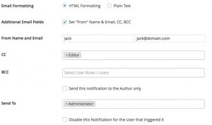
On the next section, you will be asked to choose email formatting, add additional email fields such as cc, bcc, and select which user role will receive the notification email.

Better WordPress Notification Select User Role

This plugin supports custom roles, so if you are using a membership plugin, then those user roles will appear here as well. You can also choose to send the notification to the main user who triggered the action or disable the notification for them by using the respective checkbox.

Now comes the actual notification email part.

Better Notifications for WordPress - Email

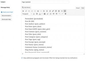
First you need to provide a subject line for your notification email. After that, you need to enter the message body. Make sure that your message is descriptive and contains links so that users receiving the notifications know what they are expected to do next.

The plugin accepts a number of shortcodes, so you can use those tags inside your notification message to display post permalinks, usernames, comment id, comment links, user names, etc. See the full list of tags.

Once you are finished, simply click on the Send Me a Test Email button.

Better WordPress Notifications - Send Test Email

If everything looks good in the test email, then click on the save button to enable this notification.

Troubleshooting

If for some reason, your users are not receiving the email, then the first thing you need to check is that you have selected the correct user role or username for the notification.

After that check out our guide on how to fix WordPress not sending email issue which will surely fix the issue.

We hope this article helped you learn how to add and customize notifications in WordPress. You may also want to take a look at our guide on how to monitor user activity in WordPress.

If you liked this article, then please subscribe to our YouTube Channel for WordPress video tutorials. You can also find us on Twitter and Google+.

The post How to Add Better Custom Notifications in WordPress appeared first on WPBeginner.

EDD Bookings Released – The Bookings Add-on for Easy Digital Downloads

Today we announce the release of the EDD Bookings add-on. This plugin adds a booking system to your WordPress site, allowing customers to book and pay for appointments, meetings, consultations and more. Basically, any event, service or resource that needs to be scheduled by date and time can be handled by this Easy Digital Downloads add-on.

Torque Weekly Digest: 12/14/15

Here we provide a weekly recap of the biggest stories from torquemag.io. Dedicated to informing new and advanced WordPress users about the industry, Torque is a hub for WordPress news, business, and community. Here are some of last week’s top stories from Torque:

Kinsta’s Battle Royale: HHVM vs. PHP7Torque Weekly Digest: Kinsta's Battle Royale: HHVM vs. PHP7

Kinsta, a hosting company based out of L.A. and London, ran a test between PHP 5.6, PHP 7, and HHVM to see which will bring you the fastest website. See the results…

5 reasons to start a plugin businessTorque Weekly Digest - 5 reasons to start a plugin business

Not only is a plugin business considered a lean startup, but there are other benefits to starting this sort of company, like extending its services beyond WordPress. Learn about the pros and cons, as well as the most important things you should consider before starting your own plugin empire.

Tips for designing mobile ecommerce apps

mobile-ecommerce-app-torqueWhat makes for the most perfect e-commerce app? The checkout process and user-friendly functionalities, to name a few. Read on to learn about the most essential tips for optimizing your e-commerce app for an enhanced user experience and increased sales.

WordPress Custom Post Type (Beginner’s Tutorial) 

Torque Weekly Digest - WordPress Custom Post Type, A Tutorial For BeginnersAt times, the standard types of content (e.g. posts, pages, and attachments) offered by WordPress isn’t enough. Follow this tutorial to easily learn about how you can use Custom Post Types (CPT) to customize your WordPress site beyond the standard content post types offered. Learn how…

2015 State of the Word

2015 State of the Word - Matt MullenwegLast week during the inaugural WordCamp US, Matt Mullenweg delivered his annual State of the Word address to a crowd of roughly 1,800 people. Read about the top highlights and takeaways from the speech.

Stayed tuned for more feature stories and news from torquemag.io.

The post Torque Weekly Digest: 12/14/15 appeared first on WP Engine.

Sunday, December 6, 2015

10 Simple Tips for Learning CSS for WordPress

Learning CSS can be overwhelming, especially when you don’t know where to start and what terms to search for when you get stuck.

Since CSS is a styling language and not a full-on programming language like Javascript or PHP, it’s actually fairly simple to learn, especially if you have some HTML knowledge under your belt (which I assume you have for the purposes of this post).

In our recent blog survey, an overwhelming number of you mentioned you wanted to up your game and get more familiar with CSS and that’s why we recently published a list of over 150 resources for learning CSS, which should help you get started, especially in tandem with this post.

Today, I’ll show you the workflow and tips that helped me learn CSS when I first started out many years ago. Start with tip one and work your way down the list to CSS mastery.

1. Basic Construction

First thing’s first: In order to learn how to write your own CSS, you need to know how to properly format it. There are actually two correct ways to do this, but one of them helps keep you more organized.

Since it’s common for HTML to be the first language people learn when they want to work with WordPress sites, it helps to learn CSS syntax by first writing it out in a similar way to HTML.

Here’s the basic structure that CSS takes:

It’s simple enough when there aren’t many styles you want to implement for an element on your site, but when you start getting more familiar with CSS, you’re going to need a lot more than one style for an element and that’s where a structure like this can get messy, fast.

That’s why there’s a more efficient and organized way to write out your CSS:

Now you can start digging into the terms that are used in this example. Each of these terms are the basic building blocks of CSS: class, ID, selector, property, and value. The properties and values also make up what’s called a declaration.

This is a great starting point toward learning how to write your own CSS and once you start, you may wonder where you should write all this down within your WordPress files.

In your WordPress installation, any file you see that ends in .css is a CSS file, as you probably already guessed. The main file you need to look for is your stylesheet and it’s labeled as style.css. This is where most or all of your theme’s design is held in terms of colors, fonts, basic images and possibly some of your theme’s layout.

You may also notice a file in a pre-made theme called custom.css and this is usually where they would like you to make any changes to the theme. When you make changes in this file, it should overwrite the existing styles in the theme’s stylesheet.

If you add plugins to your theme, they may also come with CSS files in their folder and they are used to style the plugin’s look and feel.

2. Practice with Simple Selectors and Properties

Next up is learning about basic selectors and properties and how they function in a theme. Selectors such as h1, h2 and h3 for headers and p for paragraph text, for example, as well as properties such as font-family and background-color.

There’s an easy way to practice these new skills and actually see the changes you’re making, without actually having to start your own WordPress blog. W3Schools has a ton of information on CSS as well as live examples where you can change their code and with a press of a button, you can instantly see the changes you made.

When you see an example, just click on the Try it yourself button and a window opens where you can test out some basic CSS.

3. Memorize the Box Model

I’m an advocate for referencing most common pieces of information rather than committing all of it to memory. Perhaps it’s because I find my memory to be lacking much of the time, but I would much rather say it’s because there are so many wonderful references online.

You can easily look up selectors and properties you don’t know within a heartbeat. All it takes is a simple inquiry to your favorite search engine such as Google or Bing and all the information you need is just a click away from there.

The box model
It’s important to be familiar with the box model.

This may be the case with many (or most) things in life, but the box model shouldn’t be one of them.

Essentially, it’s the basic layout elements in CSS that you need in order to make sense of a lot of properties. The box layout also includes many basic places that you can style with CSS.

Luckily, it’s not difficult to learn and in all honesty, if I can memorize it, you shouldn’t have a problem with it, either. In essence, it includes a content area, padding, border and margin.

4. Learn By Doing

Once you begin to get familiar with CSS, it’s a great idea to actually put it into practice by choosing a theme that has an entirely basic design and changing its style by editing its stylesheet.

It’s important to understand how simple changes can affect a theme drastically sometimes and other times not so much. Ultimately, practicing as much as you can should help you visually see the changes you make and connect your actions of writing code to the final result.

In the grander scheme of things, once you’re able to connect the dots you can not only write CSS quickly but you should also be able to troubleshoot issues in the future which becomes a critical task for web designing and developing.

Here are some excellent themes to practice on that you can install on your WordPress site for free. Not all of them are perfect representations of how a theme should necessarily look and function, but they’re all great starting points to learn how you can change a theme with simple CSS.

  • White Spektrum

    White Spectrum theme

    This is a simple theme with a common layout which includes a main content area, sidebar, header and footer.

    Other than a splash of color when it comes to fonts and links, it’s a plain and simple theme to work with.

  • Simpler

    Simpler theme

    Simpler also has a common layout with a sidebar, but a lot less color. Its design is minimalist as well, but has one key difference: It’s responsive which means this theme looks great across all mobile devices.

  • Zircone

    Zircone theme

    Zircone is also responsive, but it doesn’t include a sidebar by default. It’s a clean theme to practice on especially since it was designed with a CSS framework foundation.

  • Mog

    Mog theme

    Mog isn’t responsive, but it’s a one-column theme with a few key design elements such as link and button styling for you to check out how these properties would work in practical applications.

  • Founder

    Founder theme

    Once you begin to really understand CSS, this is a great theme to peak under the hood and take a look at its stylesheet since it a bit more complex than the other themes listed so far.

    It’s responsive, accessibility and translation ready, includes a hamburger icon for mobile screens as well as many other CSS design details that are great to study.

  • Elucidate

    Elucidate theme

    Elucidate is a responsive theme that has a lot more CSS design elements than your average minimalist theme.

    Don’t get me wrong, it’s still a simple theme with a lot of white space, but when you dig into its stylesheet, you can see styles galore that you can learn from to implement yourself.

  • Underline

    Underline theme

    Underline has a simple layout, but also many CSS elements such as underlining that are neat to see in action. While you can underline text easily with HTML, there are many different types of underlines you can use with CSS.

    It’s also a responsive and simple theme with a sidebar.

  • Radix

    Radix theme

    Radix can either be an ultra minimalist theme or you can add color around the post title and footer.

    It’s also built with clean CSS3 so you can begin to see how a fully responsive theme can come together with a few slightly more advanced CSS features. You can also see an example of how you can add color not just to text, but to the background.

  • Capture

    Capture theme

    When you take a look at Capture, you see a responsive theme with key CSS features that are important to explore. You can see just how images can become an important background and styling element to your theme to add personality, rather than using a solid color.

  • Simply-VisiOn

    Simply VisiOn theme

    Simply-VisiOn is a responsive theme with a simple design, but that doesn’t mean it doesn’t include a lot of cool CSS styling.

    Not only can you can see simple CSS functions such as color and fonts, but you can see more advanced features such as circular avatars and menu animations.

Even with these minimalist themes above, you still may feel a bit overwhelmed with how many things you don’t yet recognize and that’s okay. As you check off each section of this post, it should all start coming together a bit more.

5. Arrange Content by Width and Height

Once you have installed one of these themes, you can also begin to change the layout by entering different lengths and widths of content areas and selectors.

It’s a precursor to the next step and gets you familiar with the different layout areas in a WordPress theme.

6. Floats and Positioning

This is where CSS tends to get a bit tricky since you can create a layout purely with CSS and in particular, floats and positioning. The problem is, these properties aren’t designed to create entire layouts and there’s a draft out there to update CSS layouts.

For now, this is a common way many people get their layout just right. It’s a great idea to observe themes that are already out there, including the list above and see how they differ with their use of floats and positions.

7. Advanced CSS

At this point, you’re really starting to get the hang of CSS, but there’s a lot more to discover:

  • Pseudo classes – Used to define a specific state of an element such as on mouse hover and positioning images in a specific place relevant to other elements.
  • Complex selectors – You can get even more specific with styling using more advanced selectors.
  • CSS3 animations – Creating a fade, pop or other transitions when you mouse over images and buttons.
  • Responsiveness with CSS3 media queries – One of the easiest ways you can create a responsive theme is by using media queries.
  • Transforms – Controls the size and shape of selected content areas.
  • At-rules – Used for importing things like fonts and stylesheets into your theme.
  • Gradients – Adding a gradient to your theme without needing to use an image.

These are many of the elements where you can really start seeing your theme’s design really take shape. It’s the perfect time to start testing your skills.

8. Replicate a Site With CSS

With all this knowledge on your belt, you might need to get a sturdier belt, but more importantly, you can really put your skills into practice by using a basic shell of a theme and adding your own CSS styles from scratch.

One of the most helpful things you can do to advance your learning is practice your knowledge in real world applications. I recommend trying to find a site you like then replicating it as best you can purely with CSS on a blank WordPress theme.

Sure, you likely won’t be able to get everything perfect and there are probably a lot of elements you won’t be able to replicate with only CSS, but it’s a great way to get you comfortable with CSS.

Here are some great and free starter themes you can use:

  • BlankSlate

    BlankSlate theme

    This is as bare bones as it gets. There’s only HTML5 in this theme so you’re free to add your CSS without worrying about any styles clashing. It does come with everything you need to start styling your theme, though.

  • HTML5 Blank

    HTML5 Blank theme

    HTML5 Blank is a boilerplate WordPress theme that includes some styling, though, not much. It’s a great start if you’re not too keen on starting your CSS from scratch.

  • Underscores

    Underscores theme

    If you’re a bit adventurous and want to try a more advanced starter theme, Underscores is an excellent option, though, not for the faint of heart since it comes with two preloaded theme sample styles. It also includes some advanced techniques and coding that makes it a great learning tool.

There’s also the HTML5 Reset WordPress Theme on GitHub. It includes features that are a bit more advanced, but that’s ultimately what makes it a valuable starter theme.

9. Preprocessors

Once you know the ins and outs of CSS, it’s a great idea to learn about preprocessors, and in particular, SASS and LESS. Both of these help organize your CSS so it’s much easier to write and more accessible for future edits.

Preprocessors make your CSS clean and easy to follow and it has quickly become an essential skill among web developers. While there’s an ongoing debate on which one is best, SASS tends to be the preprocessor that’s most used to date.

If you would like to try your hand at SASS in the context of WordPress, check out the Bones theme. It’s comprised of mostly HTML5 so you can try styling with the built-in bit of SASS that’s already included.

10. Frameworks

In web development, frameworks are a structure for creating dynamic websites. Ultimately, the goal of a framework is to make sites faster and without losing out on functionality.

Once you have CSS down pat, you can speed up your theme development by using a framework.

One of the most popular frameworks is Twitter Bootstrap. It’s created to be responsive right out of the box, uses both SASS and LESS as well as many custom CSS components.

In terms of WordPress theme frameworks, there are many to choose from including Blank Responsive Bootstrap WordPress theme, our own Upfront theme and so many more, Rachel McCollin reviewed tons in her post called Choosing a WordPress Theme Framework – The Ultimate Guide.

Wrapping Up

Armed with a syllabus for learning and with the tips to help you along the way, CSS shouldn’t be too overwhelming for you to get a handle on. Plus, you should be ready now to try your hand at styling your own WordPress theme.

For more resources on learning CSS and WordPress, check out some of our other posts: A Mega Guide to Learning and Referencing CSS for WordPress: 150+ Resources and From WordPress Beginner to Pro: 200+ Career-Boosting Resources.

What are your hurdles and triumphs for learning CSS? Feel free to share your experience in the comments below.